social impact at the intersection of data, art, & education
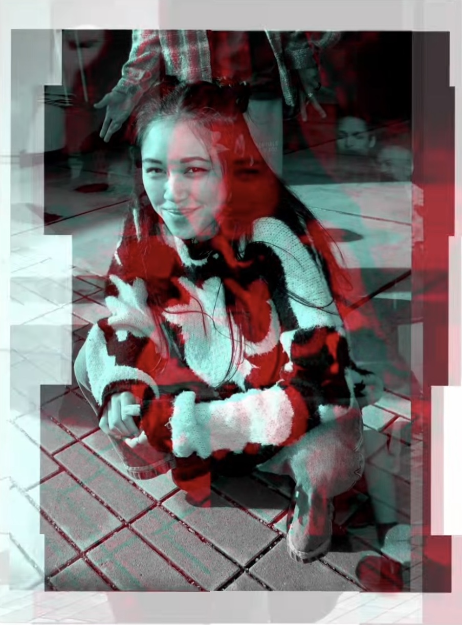
Hi, I’m Mindy. I tell vibrant, human-centered, visual stories grounded in data to make information engaging and accessible for all audiences, from everyday people to policymakers.
As a data scientist & web developer, educator, and dance artist, I see data storytelling and visualization as a natural intersection of my work -- a place where my technical background and eye for visual communication meet and bring to life stories that inform and inspire change.
Jump to:
Interactive Resume Explorer
Over the past decade, I've worn many hats. From engineering to teaching, researching to performing, these experiences sometimes felt distinct or unrelated to each other. But recently, I noticed some common threads. Each experience was connected to one or more of these key themes:
data & technology, education, and art & design.
I wanted to see what this looked like. I was curious... how has my involvement in each of these categories looked over time? I started by entering all of my experiences from the past 10 years (2015 - 2025) into a spreadsheet, and tagged them with themes, their level of time commitment, and duration. Then, I visualized it.
Click on items in the chart below to explore.
Experience Timeline
Category
Time Commitment
At a glance, the colors in the Experience Timeline look relatively balanced. But has is always been this way? Have I maintained a balance or have I prioritized categories in different periods of my life?
Evolution over time
Category
Data & Methodology
To create this chart, I partitioned the data into 3 month periods. Each experience was given a weighted score for each category (some experiences were more focused in one category, or had higher time commitment). I summed the scores for each category for experiences that fell within that quarter and divided by the total to get the % of time spent on each category. Made with the ggplot2.
At first, I was surprised to see how drastically tech and education pushed art out of my life in that middle period. But I remember how it felt. Those years were challenging, and the disappearance of art from my day-to-day made me realize how important maintaining balance is. Each of these themes is an important part of who I am and what I can offer.
Still, I don't regret any part of my journey. During this time I developed so many technical and leadership skills that now empower me to create the things that matter to me. As I reshape my career as a freelancer, I'm finding that my strongest work is emerging when I weave together my skills and passions in ways that feel authentic, exciting, and balanced again.
Let's work together!
About This Website
This website was designed and built from scratch by me. Here's a window into my process:
Data
I converted my resume into a structured data set in Google Sheets, labeling each experience with the theme(s) it falls into and its time commitment level (full-time, part-time, or intermittent). The themes are weighted, so for example, my experience working as a software engineer in the education industry was 2 parts tech and 1 part education, because that job focused more on my technical skills than on education. I used R to process and analyze the data.
Design
I start every project by sketching ideas in a notebook, and using online design tools (like Figma), to create wireframes before actually coding. Much of what I know about design comes from working closely with UI/UX designers in the tech industry and a UI/UX course I took in college. But mostly, my ideas come from reading and getting inspired by all of the data viz out on the web! My biggest data viz inspirations are Shirley Wu, Erin Davis, and The Pudding.
Development
I built this website using Svelte. Data visualizations were brought to life with d3.js and R.